
City of Surrey
Project Title:
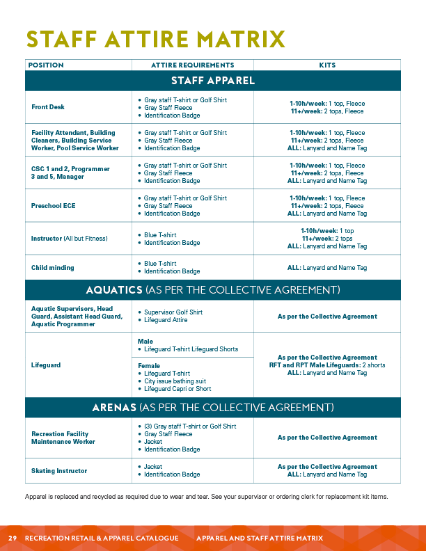
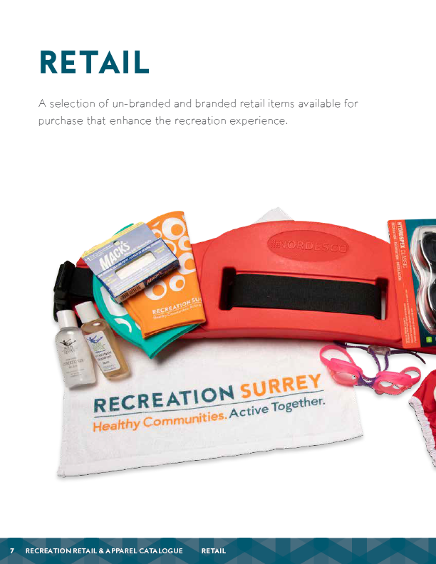
Recreation Surrey Apparel & Retail Brand Catalogue
Client: City of Surrey; Parks, Recreation & Culture / Project Date: Summer 2019
Objective
My objective was to design a comprehensive and visually appealing catalogue showcasing the apparel and retail offerings available to Recreation Surrey staff. This publication was created to be user-friendly and informative, simplifying the process for staff to identify and order necessary items.


Challenge
The core challenge was crafting a catalogue that balanced professionalism and approachability while reflecting Recreation Surrey's brand identity. The design required meticulous organization and intuitive navigation to encourage staff engagement.
Solution
I adopted a spacious, grid-based layout that prioritized high-quality product photography and readability. The catalogue was organized into distinct, easy-to-navigate sections for each product category. I prioritized high-quality product photography to showcase every item in detail and integrated comprehensive pricing and ordering instructions to streamline staff processes.
How
I designed the multi-page catalogue in Adobe InDesign, managing master pages and styles for consistency. All product photos were processed in Adobe Photoshop.
Evaluation & Impact
This catalogue was well received by Recreation Surrey staff and became an invaluable resource for ordering items. Its clear design made navigation effortless, allowing staff to easily locate products. The catalogue also helped foster a stronger sense of unity among staff by reinforcing a cohesive team identity. The project showed that a clear design improves user experience, and a well-organized layout is crucial for user efficiency.
Project Title:
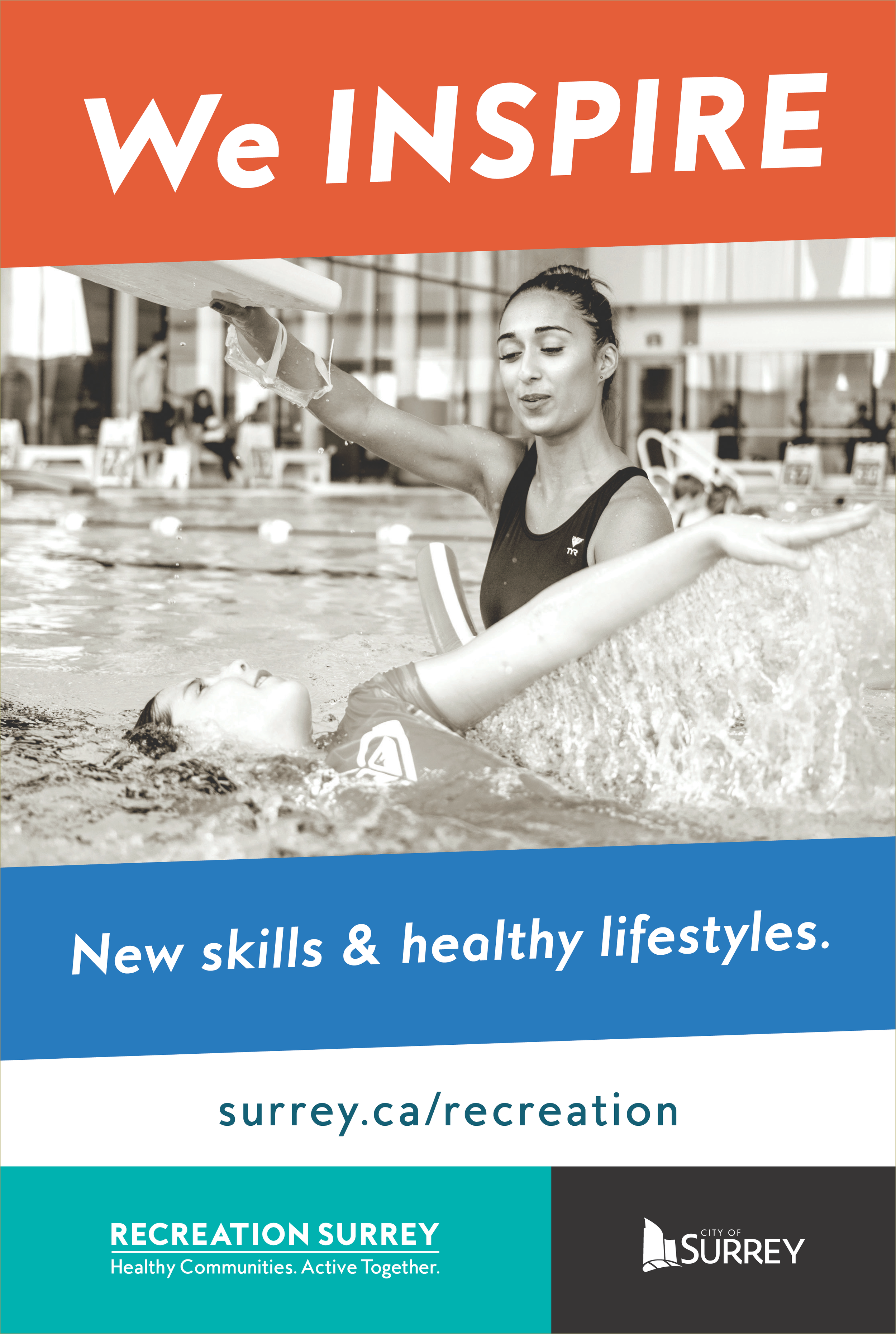
Recreation Surrey Transit Shelter Advertisements
Client: City of Surrey; Parks, Recreation & Culture / Project Date: Winter 2018
Objective
My objective was to create a compelling series of transit shelter advertisements to promote Recreation Surrey's diverse programs and services, aiming to be visually striking and inspiring residents to engage in local recreational activities.


Challenge
The core challenge was designing advertisements that would stand out in a busy urban advertising landscape while effectively communicating the benefits of Recreation Surrey's programs. Each ad needed to be concise and impactful, while adhering to the city's brand guidelines.
Solution
I developed a series of ads that paired active, high-energy photography with a single, powerful headline in a bold, condensed sans-serif to make the core message legible from a distance. Each advertisement was strategically themed, focusing on topics such as health and wellness, community engagement, or family fun. I included a strong, clear call to action in every ad, encouraging viewers to visit the Recreation Surrey website or contact the department for more information.
How
I created the ads in Adobe InDesign to ensure they could be scaled for large-format printing, with photo edits and adjustments made in Adobe Photoshop.
Evaluation & Impact
These transit shelter advertisements successfully raised public awareness of Recreation Surrey's programs and services. The compelling visuals and clear messaging inspired residents to increase their participation in recreational activities, thereby enhancing community engagement. The project reinforced that strong visual design is paramount for capturing attention in public spaces, and that a powerful call to action is crucial for encouraging viewers to take the next step.
Project Title:
North Surrey Ice Centre opening 3-sided display
Client: City of Surrey; Parks, Recreation & Culture / Project Date: Summer 2019
Objective
My objective was to design an engaging and informative three-sided display promoting the grand opening of the North Surrey Ice Centre. This display was crucial for capturing attention, communicating key information, and inspiring residents to visit the new facility.


Challenge
The core challenge was designing a versatile display that would effectively stand out across various public locations while conveying the new ice centre's features and benefits. The design had to be visually compelling yet concise enough to quickly engage passersby.
Solution
I used an energetic, open design, employing the City's brand fonts in a bold, hierarchical way to quickly capture attention, combining bold typography, vibrant colours, and eye-catching illustrations. Each of the display's three sides was dedicated to a distinct aspect of the ice centre, allowing for focused messaging. I blended text with striking visuals to convey information in an accessible way and incorporated a strong call to action to encourage residents to visit the new facility.
How
I designed the large-format panels in Adobe Illustrator, creating vector-based graphics and illustrations. The final print-ready files were prepared according to the vendor's specific 3-sided die-line.
Evaluation & Impact
This display successfully generated excitement and widespread interest in the new North Surrey Ice Centre. It was instrumental in informing residents about the facility's features, encouraging increased visits and participation. The display also strengthened the Recreation Surrey brand and underscored the City's commitment to providing exceptional community facilities. The project showed that a clear message dramatically improves understanding in high-traffic environments.
Project Title:
Recreation Surrey Personal Training Client Intake Form
Client: City of Surrey; Parks, Recreation & Culture / Project Date: Spring 2017
Objective
My objective was to design a clear and efficient intake form for clients seeking personal training services. This form needed to effectively gather all necessary information, including demographics, fitness goals, and medical history, to ensure a smooth onboarding process.


Challenge
The core challenge was designing a form that was intuitive and easy to navigate, despite requiring a significant volume of sensitive information. The form had to be clear and concise, avoiding any potential confusion that could hinder the intake process.
Solution
I adopted a clean, professional design approach, using a minimalist black-and-white colour scheme to enhance clarity. The form was organized into distinct, logical sections for each category of information. I used a combination of bold headings, clear labels, and ample white space to ensure readability and provide sufficient room for responses. I also included a dedicated section for trainers to record observations during the consultation.
How
I designed this as an interactive PDF form in Adobe InDesign, creating fillable fields and checkboxes to streamline client digital completion.
Evaluation & Impact
This intake form streamlined the personal training process at Recreation Surrey, ensuring that all necessary client information was collected efficiently and accurately. Its clear design made the form easy for clients to complete, resulting in a smoother, more positive onboarding experience. The project demonstrated that a well-organized layout is paramount for efficient information gathering, and that effective typography and spacing enhance readability and reduce user fatigue.