
SEON / Safe Fleet - Graphic Design, contract; May 2022 – August 2023
Project Title:
Smart City Isometric Illustration
Client: SEON / Safe Fleet / Project Date: Summer 2023
Objective
My objective was to produce a highly detailed isometric illustration showcasing a range of smart city technologies. The goal was to create a versatile asset that would serve as a marketing and reference tool, clearly highlighting the benefits of smart city solutions.


Challenge
The core challenge was accurately depicting a complex, bustling urban environment in a single, unified illustration. This project demanded of me meticulous planning, an exacting eye for detail, and a sophisticated understanding of perspective and scale to ensure authenticity.
Solution
To tackle these complexities, I implemented a strategic modular design approach, segmenting the city into smaller, manageable components. This methodology enabled me to develop a detailed, customizable illustration. I incorporated a rich variety of elements—from diverse buildings and vehicles to dynamic pedestrians and intricate infrastructure—to render a vibrant urban landscape. A unified colour palette and a thoughtful lighting scheme ensured a cohesive composition.
How
I executed the entire illustration in Adobe Illustrator, using its isometric grid tools and Shutterstock isometric assets to maintain perfect perspective and scale.
Evaluation & Impact
The completed isometric illustration was an invaluable asset, successfully deployed across a wide array of marketing materials. It was highly effective in articulating the value proposition of SEON/Safe Fleet's smart city solutions, generating interest and engagement among clients and partners. This project demonstrated that a modular design approach enhances both efficiency and flexibility when tackling complex visual projects.
Project Title:
Transit Clear Lane White Paper
Client: SEON / Safe Fleet / Project Date: Summer 2023
Objective
My objective was to design a comprehensive White Paper to promote the ClearLane Automated Bus Lane Enforcement System. The document needed to be informative, visually engaging, and tailored for a diverse audience, including transportation agencies, city planners, and policymakers.


Challenge
The core challenge was to distill complex technical information about the ClearLane system into easily digestible content, all while maintaining a professional design aesthetic. The materials also required versatility to be deployed across various marketing channels, including print and digital platforms.
Solution
To address these challenges, I developed a consistent design language that integrated the Safe Fleet brand identity throughout the White Paper and its derivative materials. I created a clean, modern layout with clear typography and impactful imagery. To serve the diverse distribution needs, I developed materials in a variety of formats, including detailed brochures, informative infographics, and dynamic presentations. Key messaging and statistics were strategically highlighted to underscore the benefits of the ClearLane system.
How
The White Paper was designed in Adobe InDesign, with supporting infographics and data visualizations created in Adobe Illustrator and Photoshop.
Evaluation & Impact
This White Paper was effective in raising awareness for the ClearLane system and generating interest from prospective clients. It became a cornerstone asset in marketing campaigns, successfully used at major trade shows and industry conferences. The clear messaging was instrumental in educating potential clients and facilitating productive sales discussions. This project demonstrated the power of data visualization in conveying complex technical information in an accessible manner.
Project Title:
Illegal Passing Suite Brochure
Client: SEON / Safe Fleet / Project Date: Summer 2023
Objective
My primary goal was to redesign the internal spread of the Illegal Passing Suite brochure to clearly communicate its features and benefits. The updated design needed to be engaging, informative, and aligned with Safe Fleet's brand identity.


Challenge
The main challenge was condensing substantial technical information into a format that was both visually appealing and easy to comprehend. The design had to be clear and concise, highlighting key features without overwhelming the reader.
Solution
I adopted an uncluttered, grid-based layout, combining compelling typography, impactful imagery, and data visualization. The layout was organized into distinct sections, each designed to highlight a particular feature of the Illegal Passing Suite. I used large, bold headlines and concise bullet points to convey information effectively, while integrating high-quality images and clear diagrams to illustrate the technology and its applications.
How
The brochure was designed in Adobe InDesign, with supporting graphics created in Adobe Illustrator and Photoshop.
Evaluation & Impact
The redesigned brochure was well received by the sales team and proved effective at generating interest in the Illegal Passing Suite. Its clear presentation of complex information was instrumental in facilitating sales discussions and educating potential clients. The project showed that effective use of typography and imagery is paramount for improving readability and visual appeal in technical sales materials.
Project Title:
Public Safety Hero Infographic
Client: SEON / Safe Fleet / Project Date: Spring 2023
Objective
My objective was to design an informative and compelling infographic that highlights the critical importance of fleet safety in the waste management industry. The infographic needed to convey key statistics while encouraging participation in the Public Safety Hero Award Program.
Challenge
The primary challenge was presenting sensitive data, such as accident and fatality rates, in a clear, concise, and empathetic manner. The design needed to be visually striking and memorable without distressing the audience.
Solution
I employed a strategic combination of bold typography, eye-catching visuals, and sophisticated data visualization techniques. The infographic was organized into digestible sections, each focusing on a specific aspect of fleet safety. Key statistics were highlighted using strong typography and arresting graphics. A clear and compelling call to action was integrated, urging viewers to nominate drivers for the Public Safety Hero Award Program.
How
This infographic was built in Adobe InDesign, with supporting graphics created in Adobe Illustrator.
Evaluation & Impact
This infographic was effective in raising awareness about fleet safety in the waste management industry. It was instrumental in generating interest in the award program, resulting in a noticeable increase in customer nominations. This project demonstrated that data visualization is a powerful tool for communicating sensitive information in an accessible way, and it highlighted the value of a strong call to action in driving audience participation.
Project Title:
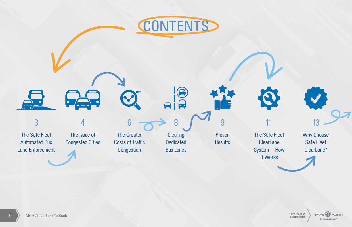
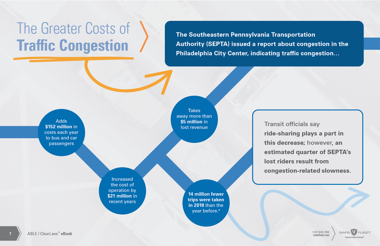
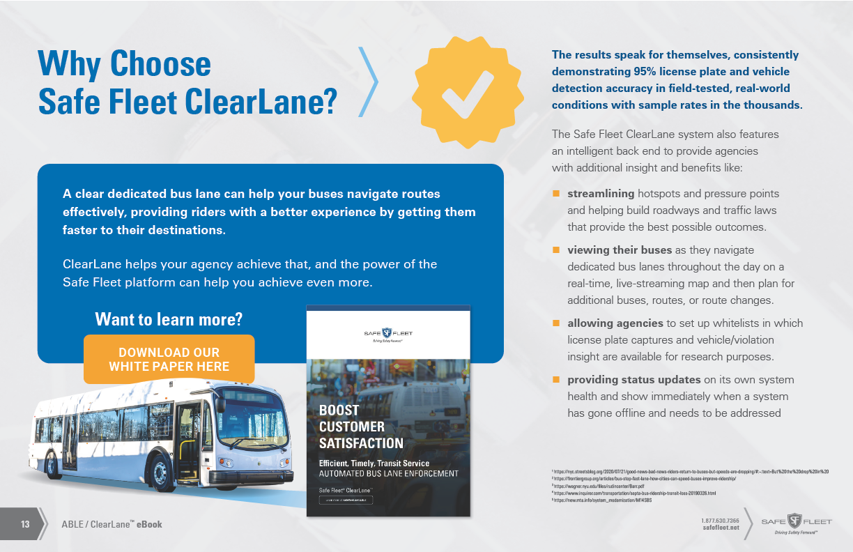
ABLE ClearLane eBook
Client: SEON / Safe Fleet / Project Date: Fall 2021
Objective
My objective was to design a visually engaging and informative eBook promoting the ClearLane automated bus lane enforcement system. This digital publication was essential for communicating the technology's capabilities and its positive impact on urban mobility.


Challenge
The primary challenge was translating complex technical information into a format that was clear, concise, and accessible to a diverse audience. The design needed to be interactive and optimized for a seamless digital reading experience across various devices.
Solution
I adopted a modular design approach, segmenting the content into easily digestible sections. The layout used a clean and professional aesthetic, combining compelling typography, imagery, and data visualization to enhance readability. I highlighted key statistics and integrated interactive elements, such as clickable links and expandable sections, to provide users with seamless access to additional resources.
How
I designed the eBook as an interactive PDF using Adobe InDesign, embedding hyperlinks and creating interactive elements directly within the program.
Evaluation & Impact
This eBook became a key tool for the sales team, effectively educating prospective clients and generating interest in the ClearLane system. Its interactive design made the information more engaging and memorable for readers. The client reported that the eBook was a key tool in their marketing efforts, helping to raise awareness of their innovative products. This project solidified my understanding that integrating interactive elements enhances the user experience and drives deeper engagement.
Project Title:
Modular Tradeshow display
Client: SEON / Safe Fleet / Project Date: Summer 2023
Objective
My goal was to design a highly versatile and visually striking tradeshow display. Its core requirement was adaptability, allowing easy customization for various industry segments and marketing messages, while remaining simple to assemble.


Challenge
The central challenge was creating a display that could balance flexibility and high impact. The design had to be visually appealing and informative, yet durable and easy to transport, with interchangeable components that enabled a wide array of configurations.
Solution
I developed a modular display system that combined lightweight aluminum frames with high-quality fabric graphics. This modularity was key, allowing for effortless customization by swapping graphics and reconfiguring layouts for specific industry segments. I incorporated vibrant, high-quality graphics and engaging visuals to ensure the display was visually arresting and commanded attention. The system was engineered for durability and ease of transport.
How
I created the initial layouts in Adobe InDesign and Photoshop to ensure they could be scaled for large-format printing, with final text and layout adjustments made in Adobe Illustrator.
Evaluation & Impact
This modular tradeshow display became a cornerstone of SEON / Safe Fleet's event marketing, establishing a professional presence at numerous industry events. The design's flexibility enabled the company to adapt to changing marketing needs and target specific audiences. Its informative nature was crucial in generating valuable leads and building brand awareness. This project demonstrated that a modular approach offers unparalleled adaptability for diverse applications.